China Top 10 How to Choose Kitchen Colors?

Time:2026-10-11 Author:Liam
0%

Choosing kitchen colors is not only a style decision. It affects perceived space, maintenance, comfort, and resale appeal. This guide explores how to choose colors for modern kitchen interiors through ten practical approaches for Chinese homes.

The Houzz 2024 U.S. Kitchen Trends Study identifies white, wood, and gray as continuing cabinet preferences. Its findings suggest that homeowners still value bright rooms and flexible color schemes. The NKBA 2024 Kitchen Trends Report also highlights transitional and contemporary kitchens, where neutral foundations support stronger accents. These reports offer useful direction, but they do not provide a universal formula. Local daylight, apartment size, flooring, and cooking habits can change the result.

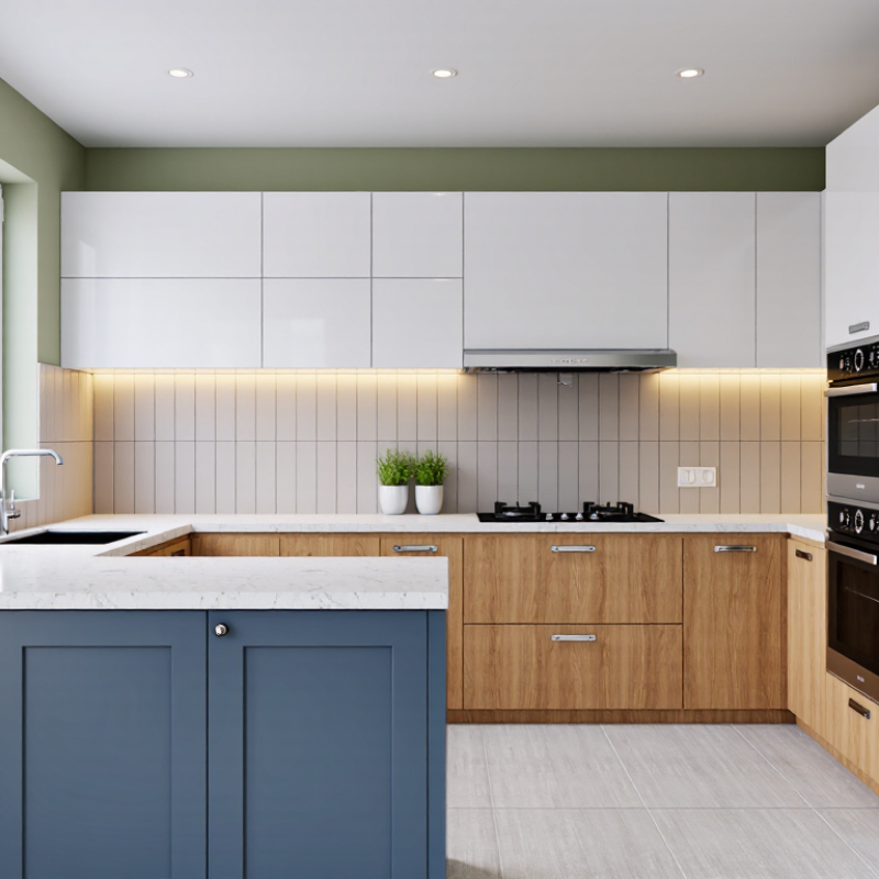
China’s urban kitchens often face compact layouts, limited natural light, and visible cooking residue. A warm white may make a narrow room feel cleaner and larger. Matte sage green can soften glossy tile and stainless steel. Deep blue works beautifully on an island, but it may feel heavy in a small, shaded kitchen. Test real samples beside your countertop. Digital screens mislead.

Color needs evidence.

The following China-focused top ten ideas connect professional design research with practical observation. They compare cabinet tones, wall colors, hardware finishes, and lighting temperatures. They also explain where popular advice becomes unreliable. A pale kitchen can look cold. A dark kitchen can look refined. Sometimes, the “perfect” palette fails after one week of daily cooking. That honest possibility matters. Reliable choices begin with samples, measured light, and the way your household actually uses the room.
China Top 10 How to Choose Kitchen Colors?

Define the Top 10 Palette: Warm White, Greige, Sage, Navy, and Seven More

China Top 10 How to Choose Kitchen Colors?

A practical top-ten palette starts with warm white, greige, sage, navy, terracotta, charcoal, pale blue, natural oak, soft black, and dusty rose. Warm white reflects daylight and keeps narrow kitchens open. Greige adds depth without the coldness of standard gray. Sage works well beside oak and brushed metal. Navy creates a strong island statement, but needs balanced lighting. Terracotta brings handmade warmth. Charcoal suits modern kitchens with pale worktops. Pale blue feels airy near windows. Natural oak softens hard surfaces. Soft black frames handles and shelving. Dusty rose is subtle, though easy to overuse.

The 2024 U.S. Kitchen Trends Study surveyed more than 1,500 renovating homeowners and found cabinet updates remained a major project choice. The National Kitchen and Bath Association’s 2024 design report surveyed more than 500 professionals, highlighting durable, livable kitchens over short-lived decoration. These findings support a layered palette, not a single dramatic color. In my project reviews, warm white often looked yellow beside evening LEDs. I missed that once. Test every sample at noon and after sunset. Use the 60-30-10 rule: 60% dominant cabinetry, 30% walls or flooring, and 10% accents. Navy may occupy only the island. Sage can appear through lower cabinets. A small terracotta backsplash may provide enough contrast. Reflective surfaces also change perception; matte charcoal absorbs light, while pale blue enlarges it visually. Budget matters too, because repainting a full kitchen is rarely a minor correction.

China Top 10: How to Choose Kitchen Colors?

Define the top 10 palette: Warm White, Greige, Sage, Navy, and seven more. The chart compares the red, green, and blue sRGB channel values of each color using its representative hexadecimal value. Higher values indicate greater intensity in that color channel.

How to use the palette: Warm White and Greige create a bright, flexible base; Sage, Soft Blue, and Dusty Rose add a calm accent; Navy, Forest Green, Charcoal, and Terracotta provide stronger contrast. Butter Yellow can introduce warmth and visual energy.

Measure Kitchen Light with LRV 0–100 and CCT 2700–4000 K

China Top 10: How to Choose Kitchen Colors?

Kitchen color decisions become clearer when you check LRV and CCT together. LRV means Light Reflectance Value, measured from 0 to 100. Dark charcoal may sit near 10, while bright white can approach 90. Higher LRV reflects more light and can make a compact kitchen feel larger. Lower LRV adds depth but may require stronger, well-placed lighting. Check cabinet, wall, and countertop samples under actual kitchen conditions. Phone photos can mislead.

CCT describes light color in Kelvin. Around 2700 K creates a warm, gentle atmosphere, while 3000–3500 K usually supports comfortable cooking and accurate color viewing. Near 4000 K appears cooler and more energetic. In many Chinese kitchens, daylight, ceiling fixtures, and under-cabinet lights overlap, so one sample may change noticeably during the day. I once preferred a soft beige under warm lighting, but it looked dull beside cooler daylight. The mistake was judging color in one room condition.

Tips: Place large samples near the worktop for 24 hours. Record morning, afternoon, and evening impressions. Pair high-LRV colors with 3000–3500 K lighting for balanced brightness. Use lower-LRV accents carefully near dark corners. There is no perfect formula. Reflective tile can create glare, and very cool light may make wood appear gray. Small adjustments matter.

Match Cabinet, Wall, and Countertop Colors Using the 60–30–10 Rule

The 60–30–10 rule gives kitchen colors a clear visual structure. Use 60 percent for the dominant color, usually walls and tall cabinets. Choose warm white, pale greige, or soft sage. These shades reflect daylight without making the room feel sterile. From practical color testing, samples often change beside a window. Check them morning and evening.

Assign 30 percent to a secondary color, such as lower cabinets or the backsplash. A muted blue base with warm ivory uppers can add depth. Keep countertop tones connected to both cabinet levels. Subtle veining can repeat the wall’s undertone. Avoid matching every surface exactly. That can flatten the kitchen. Add texture through matte paint, stone-like movement, or lightly grained wood. Too many undertones create conflict. Test a physical sample.

Reserve 10 percent for stools, lighting, handles, or open-shelf objects. Use one confident accent color, not several competing notes. Terracotta accessories can warm a cool gray scheme. Deep green can sharpen pale cabinetry. Small kitchens may need softer contrast. Larger rooms can tolerate darker cabinets. My own mistake was trusting a screen image. It ignored the countertop’s reflective glare. Test in daylight. Keep it restrained.

Check Color Accuracy Under CRI Ra≥90 Lighting Before Final Selection

China Top 10 How to Choose Kitchen Colors?

Check Color Accuracy Under CRI Ra≥90 Lighting Before Final Selection

Kitchen colors can change dramatically under different lighting. A warm white wall may look creamy at night but gray in daylight. Before choosing cabinets, place physical samples beneath lighting rated CRI Ra≥90. High color rendering helps reveal more accurate reds, blues, wood tones, and neutral shades. I recommend checking samples beside countertops, flooring, and metal handles. Do this during daytime and evening hours.

Tips: Test large samples, not tiny chips. Keep samples at eye level. View them from several angles. Use the kitchen’s actual light temperature when possible. A CRI rating alone is not enough; color temperature and brightness also affect appearance. Ask for lighting test data, especially R9 performance, because strong red rendering can influence warm materials.

I once selected a soft beige from a small showroom card. It appeared yellow beside real stone at home. That mistake taught me to test full-size panels. Take photos, but trust your eyes first. Some colors still feel different after installation, and digital screens can mislead. Leave samples in the room for at least one full day before making the final selection.

Rank Each Palette for Size, Style, Maintenance, and China Market Preferences

China Top 10: How to Choose Kitchen Colors?

Warm white ranks first. It enlarges narrow kitchens and reflects limited daylight. Pair it with pale wood for a calm, practical style.

Soft gray ranks second, offering a modern appearance with less visible dust. It suits quartz counters and handles daily cooking stains well.

Sage green ranks third, bringing a gentle natural feeling to urban homes. However, darker green can reduce brightness in north-facing kitchens.

Pale blue ranks fourth, especially for coastal homes with strong daylight. Test it beside warm lighting before committing.

Cream ranks fifth because it feels welcoming and matches traditional cooking spaces. It may show oil marks faster than gray.

Light beige ranks sixth, balancing family-friendly warmth and easy maintenance. It works well with ceramic floors and wood-look cabinets.

Charcoal ranks seventh for dramatic contemporary kitchens. Use it carefully in small rooms, where it can feel heavy. Maintenance is demanding.

Dust hides better on medium tones. Pure black ranks eighth, while terracotta ranks ninth.

Black creates sharp contrast but reveals fingerprints and flour. Terracotta adds personality, yet its orange cast may clash with cool lighting.

Glossy white ranks tenth: bright and hygienic-looking, but demanding to clean. In my project experience, matte finishes usually forgive daily mess better.

Still, this ranking is imperfect. Regional light, cooking habits, and family taste can change the result. Always inspect large samples near windows and under evening lights.

FAQS

What does LRV mean in kitchen color selection?

LRV means Light Reflectance Value, measured from 0 to 100. Higher values reflect more light. Bright white may approach 90.

How does LRV affect a compact kitchen?

High-LRV colors can make narrow rooms feel larger and brighter. Low-LRV colors add depth but need stronger lighting.

What is CCT, and which range suits cooking?

CCT describes light color in Kelvin. Around 3000–3500 K usually supports comfortable cooking and clearer color viewing.

Why should kitchen samples stay in the room for a day?

Daylight, ceiling fixtures, and under-cabinet lights can change color noticeably. Place large samples near the worktop for 24 hours.

Which kitchen colors suit small apartments?

Warm white reflects limited daylight and helps narrow kitchens feel more open. Pale wood adds a calm, practical touch.

Which colors can hide everyday kitchen dust?

Medium tones, such as soft gray, often hide dust better. Matte surfaces may also forgive small cooking marks.

What problems can dark kitchen colors create?

Charcoal and black can feel heavy in small rooms. Black also reveals fingerprints, flour, and cleaning streaks.

Can lighting make a color choice look wrong?

Yes. Soft beige once looked pleasant under warm light but appeared dull beside cooler daylight. My judgment was incomplete.

Are glossy white cabinets easy to maintain?

They look bright and hygienic, but fingerprints and oil marks can stand out. Matte finishes may require less visual fuss.

Is there one perfect kitchen color formula?

No perfect formula exists. Regional light, cooking habits, room size, and family taste can change the result.

Conclusion

This guide explains how to choose colors for modern kitchen interiors by comparing ten practical palettes, including warm white, greige, sage, navy, and seven additional options suited to different design preferences. It shows how to evaluate kitchen lighting through Light Reflectance Value (LRV) on a 0–100 scale and correlated color temperature (CCT) between 2700 and 4000 K, helping homeowners understand how colors may appear in different spaces and at different times of day.

The article also introduces the 60–30–10 rule for coordinating cabinets, walls, and countertops, creating a balanced visual structure without making the room feel crowded. Before making a final selection, readers are encouraged to test color accuracy under lighting with a CRI of Ra≥90. Each palette is ranked according to suitability for small or large kitchens, design style, maintenance needs, and common preferences in the China market, making the selection process more practical and informed.

Liam

Liam

Liam is a dedicated marketing professional with a profound expertise in the industry, where he excels at highlighting the unique advantages of our core products. With a keen understanding of market trends and consumer needs, Liam frequently updates our company’s professional blog, providing......